Do you have an idea for an app but lack the programming knowledge to begin building it? In this weekly blog series, I will take you, the non-programmer, step by step through the process of creating apps for the iPhone, iPod touch, and iPad. Join me each week on this adventure, and you will experience how much fun turning your ideas into reality can be! This is Part 26 of the series. If you are just getting started, check out the beginning of the series here.
In my previous post we went through the steps of converting the Write Review scene in iAppsReview to iOS 7 and Xcode 5. In this post we're going to update a few more scenes and learn even more important information about Auto Layout, iOS 7's default edge-to-edge content, and how to specify a global tint for your app!
You can get the most recent version of the iAppsReview project at this link. I recommend that you follow along with the steps in this post for the best learning experience, but if you get stuck along the way, you can find the finished project at this link.
iOS 7's Edge-to-Edge Content
One of the biggest changes that affects the projects that you upgrade, is iOS 7's new edge-to-edge content layout. In iOS 7, Apple redesigned the entire look of the operating system with a view toward elevating the user's content. You can see this in built-in apps such as Weather, Calendar, and Music (Figure 1).
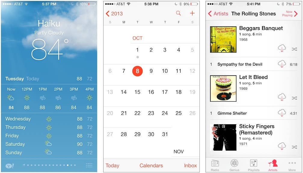 |
| Figure 1 - The updated iOS 7 built-in apps provide edge-to-edge content. |
As part of this approach to UI design, status bars, navigation bars, and toolbars are now translucent; and because of this, view controllers now default to using a full screen layout. To see this in action, let's take a look at the Review scene in the iAppsReview project.
- In Xcode, open the iAppsReview project.
- If the storyboard isn't already selected, go to the Project Navigator and select the MainStoryboard file.
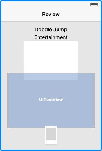
- Scroll to the Review scene as shown in Figure 2.
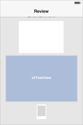 |
| Figure 2 - The Review scene |
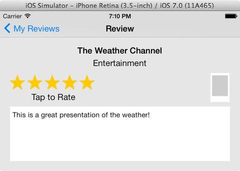
If you look closely, you can see that the labels at the top of the scene are hidden beneath the navigation bar. In iOS 6, these labels were positioned below the navigation bar, because the main view was positioned below it. In iOS 7, the view is positioned at the very top of the scene beneath the navigation bar, hiding the labels. How can we fix this?
In iOS 7, view controllers have a new edgesForExtendedLayout property that specifies which edges (top, bottom, left, and right) of a view should extend to the edge of the screen. The default setting is UIRectEdgeAll, which specifies that all edges of the view should extend to the edge of the screen.
In both iOS 6 and iOS 7, most views typically extend to the left and right edge of the screen. In iOS 7, the top and bottom edges are the ones you normally want to change. You can write some code to set the view controller's edgesForExtendedLayout property in the viewDidLoad method of a view controller, but it's best to set it in the Attributes Inspector. Let's do that now.
Modifying the Review Scene
To begin, let's fix the problem with the scene's content being hidden below the navigation bar.
- In the storyboard, click on the status bar at the top of the Review scene to select the scene's view controller. (A blue highlight appears around the scene when you have properly selected it).
- Go the Attributes Inspector (the third button from the right in the Inspectors toolbar) and in the View Controller section you can see the three attributes for Extend Edges shown in Figure 3.
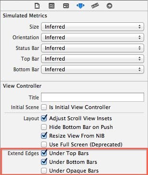 |
| Figure 3 - The Extend Edges attributes |
- Uncheck the Under Top Bars and Under Bottom Bars options. When you do this, the main view in the Review scene is displayed below the navigation bar and the labels are now visible (Figure 4).
 |
| Figure 4 - The view positioned below the navigation bar |
Unchecking these options has the same effect as running the following line of code, which specifies that the left and right sides of the view should be extended to the edge of the screen (but the top and bottom should not):
self.edgesForExtendedLayout = UIRectEdgeLeft | UIRectEdgeRight;
The Under Opaque Bars setting (Figure 4) comes into play if you have changed your navigation bar or toolbars from translucent to opaque. By default, this setting is unchecked, because it usually doesn't make sense to extend a view under a top or bottom bar that is opaque!
Now that we have the view set up properly, let's fix the layout of the user interface controls.
- First, let's delete the existing constraints in the view controller. To do this, leave the view controller selected, and then go to the Auto Layout menu (toolbar) at the bottom-right corner of the Interface Builder pane; and from the Resolve Auto Layout Issues button, select Clear All Constraints in Review View Controller (Figure 5).
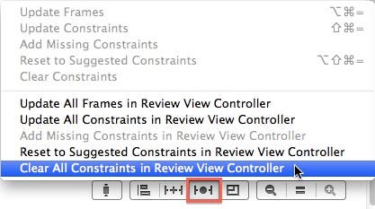 |
| Figure 5 - Clear all constraints from the view controller. |
- This particular scene is intended to be read-only (the user can read a past review but not edit it). To disallow editing, select the star-rating control (the large white rectangle below the Entertainment label) and then go to the Attributes Inspector and uncheck the User Interaction Enabled check box (Figure 6).
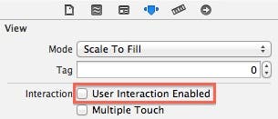 |
| Figure 6 - Uncheck User Interaction Enabled |
- Next, select the UITextView control in the Review scene. Go to the Attributes Inspector and uncheck the Editable option (Figure 7).
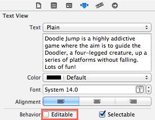 |
| Figure 7 - Uncheck the Editable option |
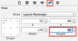
- Now let's resize the star rating control, which became oversized when we moved the project to iOS 7. Select the star rating control in the design surface, go to the Size Inspector (the second button from the right in the Inspector toolbar) and change the Height to 60 (Figure 8).
 |
| Figure 8 - The Size Inspector |
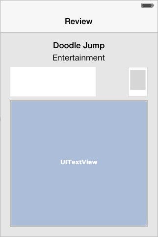
- Now let's make the Review screen reflect the layout of the Write Review screen. I won't provide detailed instructions for this since I already did in my previous post, but here are the main steps you need to perform. (As you move each control, make sure the blue dotted guide lines appear horizontally and vertically when you place the controls.):
- Move the star rating control below the Entertainment label.
- Move the image view to the right of the star rating control.
- Move the UITextView below the star rating and image view controls, and then increase its height by dragging its bottom edge until you see the horizontal guide line appear near the bottom of the scene.
When you're finished, the scene should look like Figure 9.
 |
| Figure 9 - The rearranged controls |
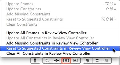
- Now let's allow Xcode to generate new constraints for the scene. To do this, click the status bar at the top of the Review scene to select the view controller. Next, go to the Auto Layout menu at the bottom-right corner of the Interface Builder pane, click the Resolve Auto Layout Issues button and then select Reset to Suggested Constraints in Review Controller from the popup menu (Figure 10).
 |
| Figure 10 - Reset constraints in the view controller |
- The Review scene's layout is very similar to that of the Write Review scene. We need to take one more step so that the star rating control doesn't resize itself when the device orientation is changed to landscape. See if you can figure out how to do this. If you need a hint, you can look at my previous post to see how it was done (look in the section Tweaking the Constraints).
- Now we're ready to test the scene. In the Scheme control at the top-left of the Xcode window, make sure iPhone Retina (3.5-inch) is selected, and then click Xcode's Run button.
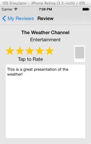
- When the app appears in the Simulator, select the Read Your Reviews option and then click on any of the reviews in the list. Your Review scene should look like Figure 11.
 |
| Figure 11 - The updated Review scene |
- From the Simulator menu, select Hardware > Rotate Right, and your Review scene should look like Figure 12.
 |
| Figure 12 - The Review scene in landscape orientation |
- To see how this scene looks in the iPhone Retina 4-inch form factor, go back to Xcode and click the Stop button. In the Scheme control, select iPhone Retina (4-inch), and then click Xcode's Run button.
- When the app appears in the Simulator, select the Read Your Reviews option and then click on any review in the list. Your review should look like the image on the left in Figure 13. Now from the Simulator menu, select Hardware > Rotate Left, and your review should look like the image on the right in Figure 13.
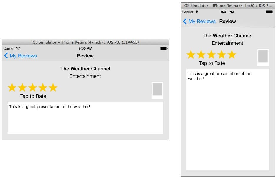 |
| Figure 13 - The Review scene in the iPhone Retina (4-inch) simulator |
Updating the Remaining Scenes
Rather than walking you step by step through the process of updating the Settings, Sign Up, and Feedback scenes, I have simply updated them in the completed project for this post, which you can get at this link. Figure 14 shows the updated version of each of these scenes. (I'll show you how to change this in the next section.) I recommend trying to change these scenes on your own to test your Auto Layout skills.
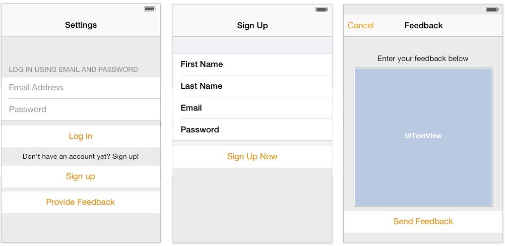 |
| Figure 14 - The updated Settings, Sign Up, and Feedback scenes |
What about the other scenes? We don't have to change anything about the other scenes to make them work properly because they are simple table view controllers that manage a single table view. These views are automatically updated properly by Xcode when you move them from iOS 6 to iOS 7.
Changing the App's Tint Color
In iOS 7's minimalist user interface, Apple makes good use of color to distinguish between built-in apps. For example, Figure 15 shows the app tint of Game Center (purple), iTunes (aqua), and Calendar (red).
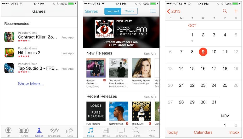 |
| Figure 15 - Apple's built-in apps have different tints to distinguish themselves from other apps. |
By default, your app's tint color is set to blue. If you want to change the color, Xcode makes it very easy. Let's change the iAppsReview tint to show you how.
- In the Project Navigator, select the MainStoryboard file.
- Go to the File Inspector (the first button on the left in the Inspector toolbar).
- In the Interface Builder Document section, click on the color chooser for the Global Tint setting (Figure 16) and select the desired color (I selected Tangerine from the Crayons dialog.)
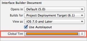 |
| Figure 16 - Changing the Global Tint |
That's it, now all the scenes on your storyboard will use the new Global Tint for button text!
Conclusion
Xcode 5 has definitely made it much easier to create a user interface that can adapt to a wide variety of screen sizes and orientations. This is a welcome and necessary change from Xcode 4.x. I haven't covered everything there is to know about Auto Layout, but as I continue through this series, I'll show you other tricks and tips for creating the best user interface layout for your apps.