 Recently I’ve begun a quest in finding a new job; however nowadays there are so many resources at our disposal that it can be quite daunting in sorting them all out. One surprising resource is the iPhone app. If you ever noticed in Apple’s App commercials there is an app for almost everything in their store or as they would say “There’s an app for that.” Yet, despite the fact that like many iPhone users, I use apps for many things; I never thought of using an app to find a job until I was in need of one. So far the best app in my experience has been Monster.com’s job search app for the iPhone.
Monster’s iPhone app is not the most popular career search app in the iTunes store at the moment, however, the newest version of the app was just released a couple of days ago so hopefully in time the app will stabilize with future updates. In some of the published user reviews for the app, some people have stated that they have experienced app crashes, and some things not loading properly. In spite of this, I did not experience many problems except for the app crashing once or twice. Besides those minor events the app performed beautifully. Now let’s see just how well Monster’s app did.

User Interface & Navigation
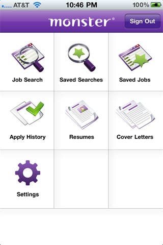
When it comes to apps, the Monster UI follows the unwritten rule that simplicity works best in any app. The design is very clean and simple, which makes it very easy to navigate through. In the main menu, there are six categories to choose from: job search, saved searches, saved jobs, apply history, resumes, cover letters and settings. From a design aspect, the location of the app’s categories is pretty straightforward. And as a user you are pretty much presented with all the functions the Monster app has to offer. Navigating through each of the menu categories is also extremely easy. There is no constant swiping through a multitude of windows, which in most apps can become quite cumbersome. You simply select the category, and are taken to your initial destination. Overall there were no complaints about the UI or the navigation. Everything simply worked the way it was supposed to.
Functionality
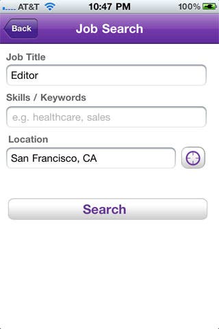
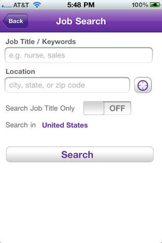
Monster’s functionality is just as direct as the UI. Intertwined the app’s UI and design create the best user experience. Of the six categories/options in the main menu you are taken directly to each of the app’s functions. The first option is job search, which enables you to search for a job in three different ways; job title, skills/keywords, and location. You can search using all of these filters or use them in one at a time. The only thing that seemed out of place with job search is that the other filters/search parameters were separated from the job search category, and placed under settings. In settings you could choose from two kinds of searches: beta or standard. Beta allowing for the three types of filters or Standard which only enabled two filters by combining job title and keyword together. On the other hand, it does make sense to place these parameters in the settings category as a default for all searches; yet it would’ve made the “job search” function more comprehensive if more filters to personalize a specific search were allowed in search menu instead of just the settings menu. Besides this hiccup, the job search delivered a good amount of results under the filters I had chosen. From job title to location, Monster did a thorough job of finding what I basically needed.
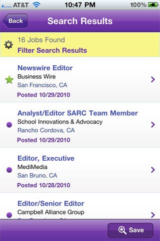
The other categories in the main menu mainly enhance and support Monster’s job search feature. The “saved searches” and “saved jobs” categories add to search by letting you save the search in its entirety or a specific result. Once you find a job that you would like to apply for Monster will allow you to apply for that job within the app; provided that the employer has allowed this in their posting. Some companies require that you apply directly to their site. However, Monster allows for you to save a job within the app or share it via e-mail.
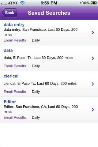
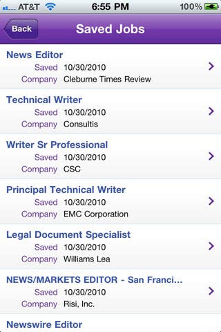
Apply history is also very handy because it saves a record of every job you apply for. Resumes and cover letters are also very important features that support the apply function of Monster itself. Each category allows you to view the resume and cover letter that you have uploaded to your profile through Monster’s website. The only downfall to both options is that editing and deleting functions are not enabled on the app like they are on the website. The last category in the app is settings, which basically sets up all the default filters and guidelines for Monster’s job search. You can either chose beta or standard.
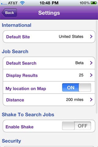
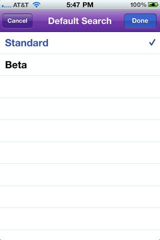
Beta allows you to use three different filters, while standard allows you to use two filters at a time (as explained earlier in the UI & Navigation section). Other features included in settings for the search function were the choice of how many results were displayed, tracking your location, and distance parameters for job description’s location. Settings also gives you the choice of what country you want the app to search in, security to force a login once you exit the app, and the actual shake feature to initiate a new search.
Conclusion
In general, Monster.com’s iPhone app created a very simple and streamlined search experience. I was able to find what I needed, and apply to different jobs painlessly within the app. In turn, this app has made job hunting much simpler. Monster’s job app is free, and can be found in the app section of the iTunes store. If you are in need of enhancing your job search I highly recommend this app on a scale of 7/10.
Overall Score 7/10
*Note: If you need to widen your search beyond Monster’s app I suggest you use CareerBuilder.com’s iPhone app, CraigsPro Free or CraigsPro + (which are 3rd party Craigslist Apps). Career Builder and CraigsPro Free are free, while CraigsPro + is $0.99 in the iTunes app store. All of these apps are very similar in function and features to Monster.com’s iPhone app.


