
Do you have an idea for an app but lack the programming knowledge to begin building it? In this weekly blog series, How To Unleash Your Inner App Developer, I will take you, the non-programmer, step by step through the process of creating apps for the iPhone, iPod Touch, and iPad. Join me each week on this adventure, and you will experience how fun turning your ideas into reality can be! This is Part 5 of the series. If you're just getting started now, check out the beginning of the series here.
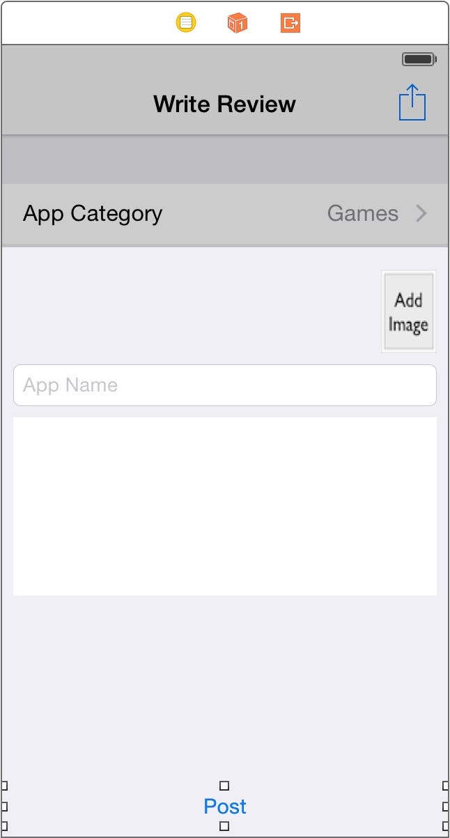
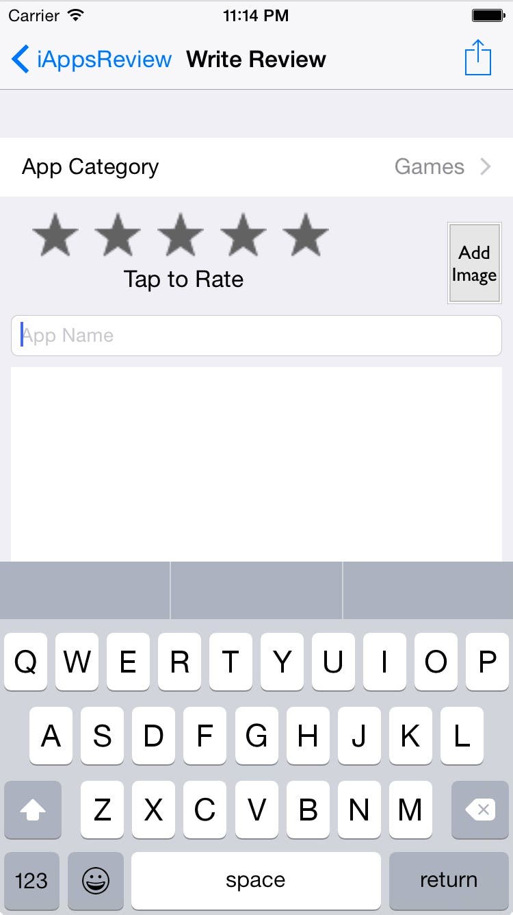
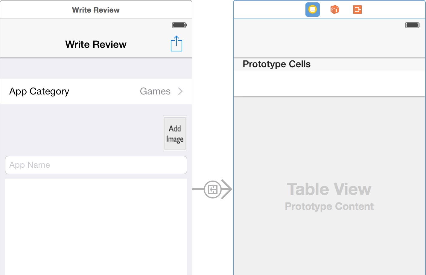
In my previous post, you learned about navigating between different scenes in your app, and learned about using custom user-interface controls in your apps. We started building the Write Review scene (shown on the left side of Figure 1), which we will finish in this post, and we'll move on to the App Category scene shown on the right side of Figure 1. (This post has been updated to iOS 8, Xcode 6.3 and Swift 1.2).

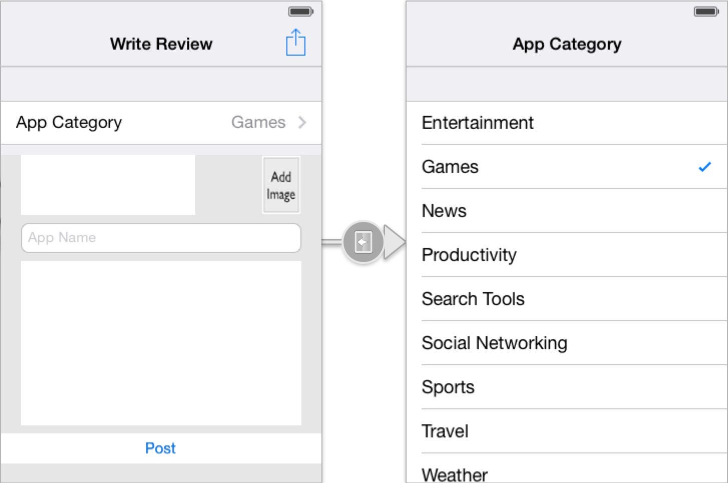 |
| Figure 1 - The completed Write Review and App Category scenes. |
Opening the Project
Follow these steps to open the iAppsReview project (you can also download the project from this link).
- Launch Xcode on your Mac, then select iAppsReview in the Recents panel on the right side of the Welcome Window and then click Open. You can also select File > Open Recent > iAppsReview.xcodeproj from the Xcode menu.
- After the project is open, go to the Project Navigator on the left side of the Xcode window and select Main.storyboard file to display it in the design surface.
Adding an Image View to the Scene
The first control we will add to the scene is an image view. An image view is used to display a single image or an animation comprised of several images. In this app, we need the image view to display a single thumbnail image of any photo the user selects from their photo album. Let's add the image view now.
- Drag an Image View from the Object Browser and position it to the right of the Five Star control button. When the vertical guide line appears on the top and right side of the image view (Figure 2), let go of the mouse button to place the image view on the scene.
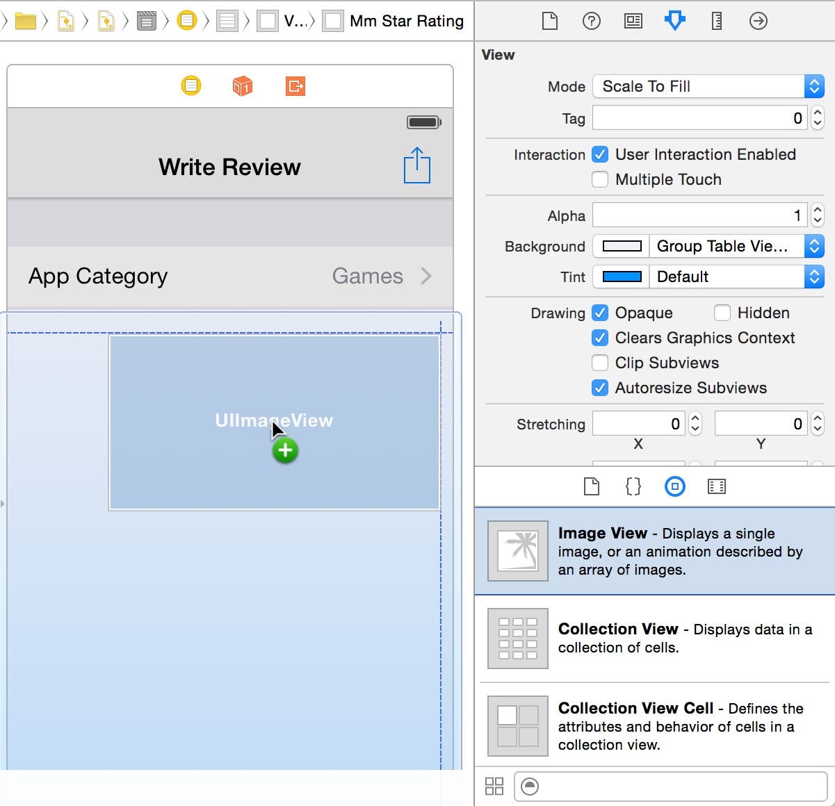 |
| Figure 2 - Add an Image View to the scene. |
- Obviously, the Image View is much larger than we want it to be, so let's make it smaller. To do this, grab the bottom-left corner of the image view and drag the corner up and to the right until the size is 40.0 for width and 60.0 for height (Figure 3).
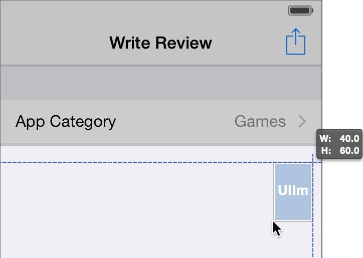 |
| Figure 3 - Resize the Image View. |
- An image view's job is to display an image. As it stands right now, when a user creates a new review, there will be no image to be displayed in the image view, so it will be invisible. Eventually, we will allow the user to click on the image view to select an image from their photo library. To indicate to the user that they can click on the image, let's add an image to the image view. In the Attributes Inspector click the down arrow on the right side of the Image attributes combo box, and select AddImage from the list. This displays "Add Image" in the image view as shown in Figure 4.
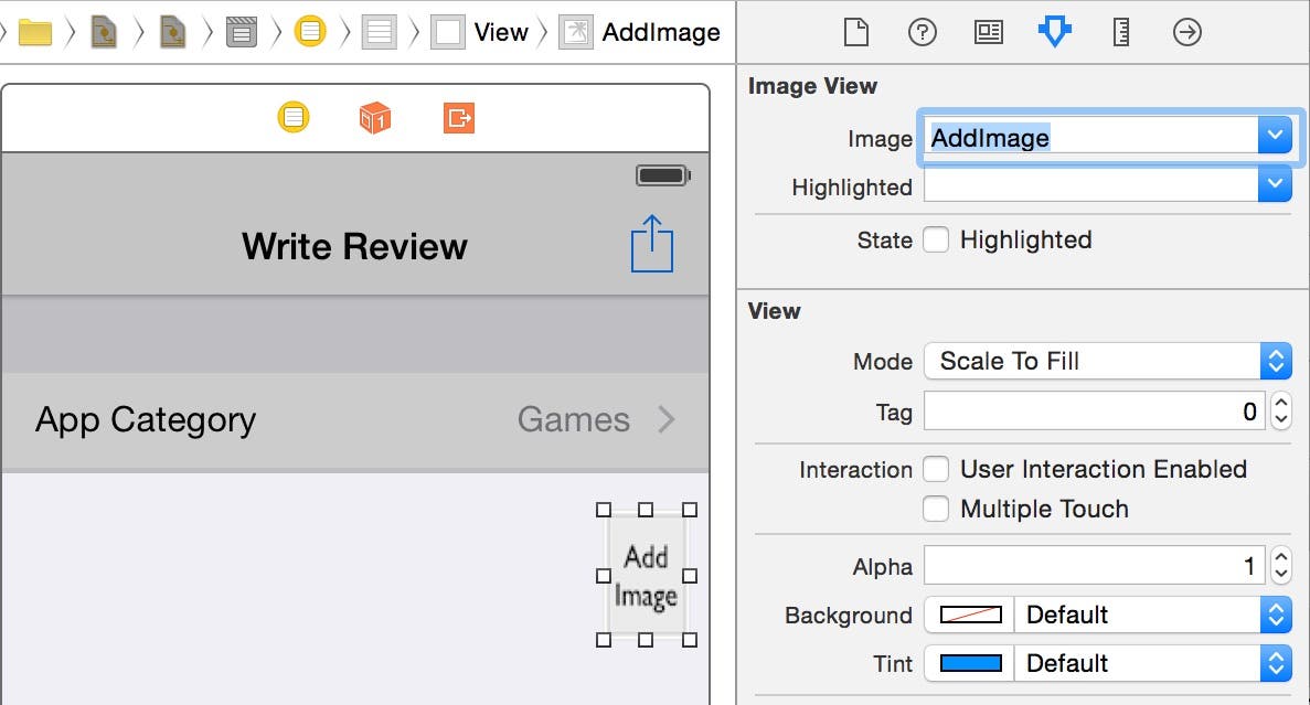 |
| Figure 4 - Set the image view's Image attribute. |
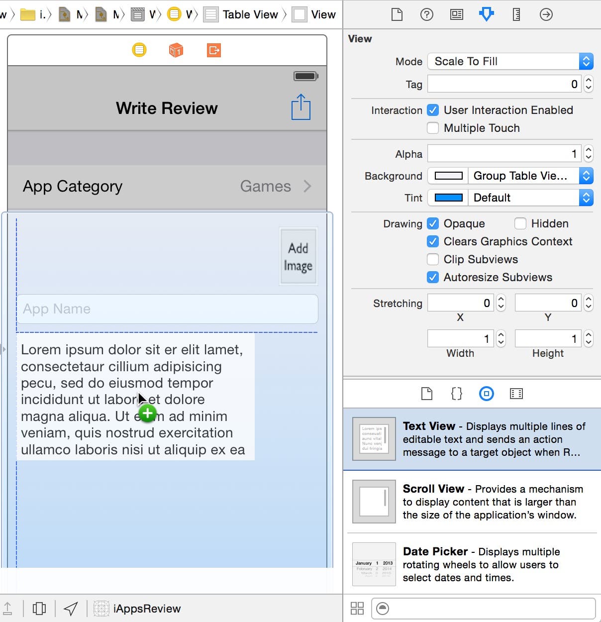
- Now let's pin the image view so it stays in its position relative to the top and right sides of its parent view. With the image view select, go to the Size Inspector by clicking the second button from the right in the Inspector toolbar on upper-right side of the Xcode window (Figure 5). On the left side of the Autoresizing section there is a square containing I-bars, double-headed arrows and an inner square.
The inner square represents the UI control that is currently selected in the design surface (in this case, the image view). The outer square represents the view that contains the UI control. The "I" bars between these two squares are known as "struts". you can select structs to pin the UI control to one or more sides of the parent view.
The arrows inside the inner rectangle are known as "springs". You can select these arrows to specify if you want the control's width and height to resize as the parent view changes size.
To pin the relative position of the image view to the top and right sides of its parent view, uncheck the I-bar on the left side of the Autoresizing square, and select the I-bar on the right side of the Autoresizing square (Figure 5).
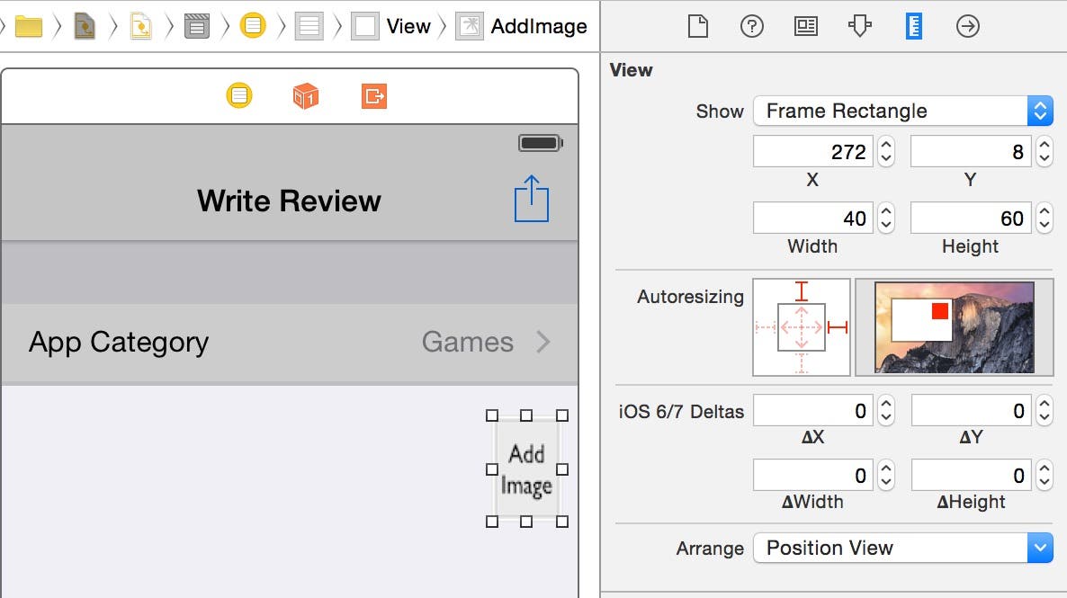 |
| Figure 5 - Pin the image view to the top-right of the containing view. |
Adding a Text Field to the Scene
In the Write Review scene shown in Figure 1, the user-interface control shown below the five-star rating control is known as a text field. A text field displays a single line of text that can be edited by the user. In this case, the text field allows the user to enter the name of the app they are rating. Let's add a text field to the scene now.
- Drag a Text Field from the Object Browser and position it below the image view as shown in Figure 6. When the horizontal guide line appears below the image view and the vertical guide line appears on the right, release your mouse button to place the text field on the scene.
 |
| Figure 6 - Add a text field to the scene. |
The horizontal guide line indicates the recommended space between user-interface controls on a scene, and the vertical guide line indicates the recommended spacing of the left edge of a user-interface control to the left edge of the scene.
- Now let's extend the text field to the width of the scene (minus the recommended spacing from the edge). To do this, click on the resizing handle (the small white square) on the left side of the text field and drag it to the left edge of the scene until the vertical guide line appears as shown in Figure 7.
 |
| Figure 7 - Resize the text field width. |
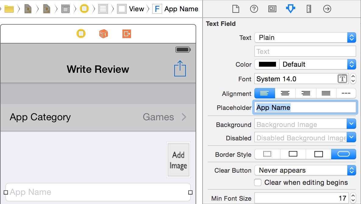
- It's a good idea to add placeholder text to a text field to provide the user with a clue as to the kind of information you want them to enter. Placeholder text (as shown on the left side of Figure 8) appears in a text field as a light gray watermark that disappears at run time as soon as the user begins typing in the text field.
To add placeholder text to the text field, go to the Attributes Inspector and set the Placeholder attribute to App Name.
 |
| Figure 8 - Set the text field's Placeholder text. |
Your text field is now ready for prime time!
Adding a Text View to the Scene
When the user writes an app review, we want to give them plenty of space in which they can express themselves. We don't want to use a text field because it can only contain a single line of text. In contrast, the text view control allows the user to enter multiple lines of text, including empty lines to create paragraphs. Let's add one beneath the text field.
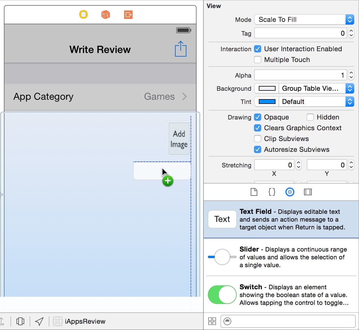
- Scroll down a little further in the Object Browser and drag a Text View directly below the text field until the horizontal and vertical guide lines appear as shown in Figure 9, and then release your mouse button to place it on the scene.
 |
| Figure 9 - Add a text view to the scene. |
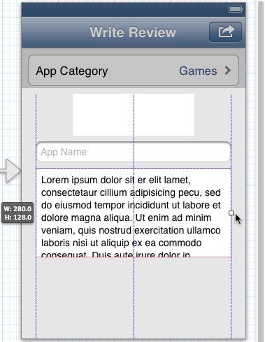
- Click on the resizing handle on the right side of the text view and pull its right edge over to the right side of the scene until the vertical guide line appears as shown in Figure 10.
 |
| Figure 10 - Resize the text view's width. |
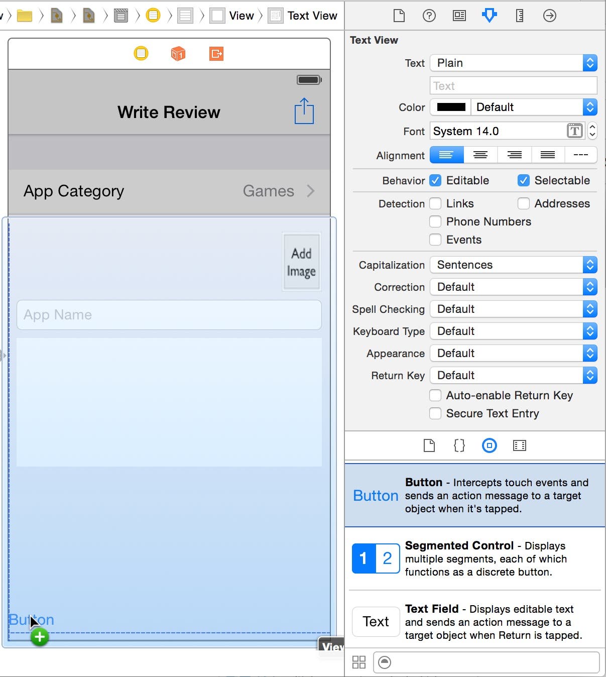
- Notice the latin text that appears in the text view control. If you have used tools such as Apple's iBooks Author, you will recognize this as placeholder text that is used to demonstrate the font and color of text that appears in the control. This is different than the placeholder text that you added to the text field. This placeholder text is meant to be deleted, so let's do that.
Go to the Attributes Inspector and click anywhere in the latin text shown in the Text attribute. Press Command+A (hold the Command key down and then press the letter A) to select all the text as shown in Figure 11. Next, press the delete key and then press return to delete all the text.
 |
| Figure 11 - Select all of the text in the text view. |
We eventually need to change the height of the text view, but let's add a user-interface control at the bottom of the scene first, so we can set the height of the text view accordingly.
Adding a Button to the Scene
There is one button that we need to add to the scene — a Post button that posts the user's review to the web. Let's add the button now.
- Drag a Button from the Object Library and position it in the bottom left corner of the scene, all the way to the edge of the scene. When the horizontal and vertical guide lines appear as shown in Figure 12, release your mouse button to position the button in the scene.
 |
| Figure 12 - Add a Button to the scene. |
- Now let's resize the button to it fills the full width of the scene. Grab the right side of the button and drag it all the way to the right side of the scene as shown in Figure 13.
 |
| Figure 13 - Resize the button. |
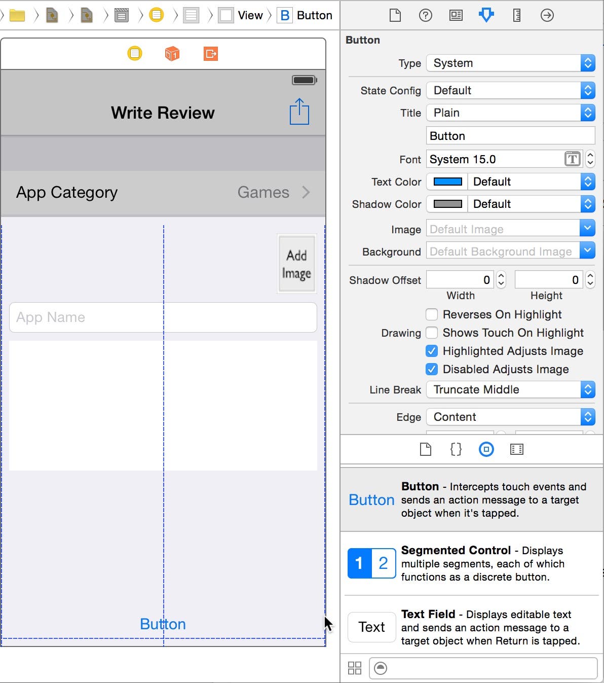
- Next, double-click the button to put it into edit mode, change the text to Post (Figure 14), and then press return.
 |
| Figure 14 - Change the button text to Post |
- Now let's change the background color of the Post button to white. With the Post button still selected, go to the Attributes Inspector and set the Background image property to white.png (Figure 15). If you click anywhere else on the storyboard you will see that the background of the Post button is now white.
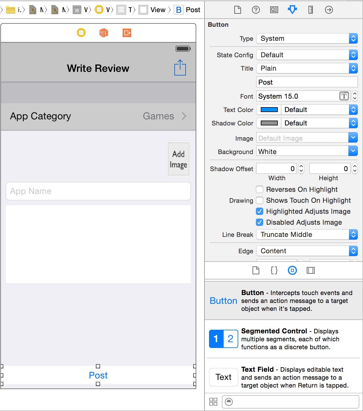 |
| Figure 15 - Set the Background image of the Post button to white.png. |
As it stands right now, this button is simply a placeholder and won't do anything at run time when the user taps it. We'll change that in a future post and make it fully functional.
- Now that the button at the bottom of the scene is positioned and sized the way we want it, we can change the height of the text view control to take up more of the available space. To do this, first click on the text view to select it, and then click the resizing handle on the bottom of the text view, and drag it downward towards the controls at the bottom of the scene. When the horizontal guide line appears (Figure 16), release your mouse button.
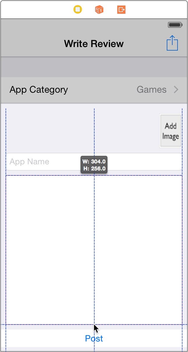 |
| Figure 16 - Resize the text view. |
Specifying the Resizing Settings
Now we need to specify the resizing settings of the text field, text view and Post button, so they resize and reposition themselves properly at run time.
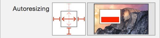
- Select the App Name text field in the design surface. Go to the Sizing Inspector by clicking the second button from the right in the Inspector toolbar. Select the I-Bar on the right side of the Autoresizing control to pin the right side of the text view to the right side of the view (Figure 17). Next, click the horizontal spring in the center of the Autoresizing control so the text field width automatically expands with the width of the view.
 |
| Figure 17 - Text field resizing settings |
- Next, select the text view (the control below the text field). In the Sizing Inspector, select all I-Bars and both the horizontal and vertical springs in the center of the Autoresizing control (Figure 18). This specifies that the text view should be pinned to all sides of the view and increase in width and height along with its parent view.
 |
| Figure 18 - Text view resizing settings |
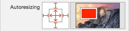
- Now select the Post button in the design surface. In the Sizing Inspector, unselect the top I-Bar, and select the right and bottom I-bars (Figure 19). Next, select the horizontal spring in the center of the Autoresizing control. This pins the button to the left, right, and bottom of its parent view and causes it to resize its width with the width of the parent view.
 |
| Figure 19 - Post button resizing settings |
Let's Kick the Tires!
Now you're finished setting up the prototype of the Write Review scene! Lets see how it works at run time.
- At the top left of the Xcode window, change the Scheme setting click the right side of the Scheme setting and select iPhone 6 (Figure 20). Next, click Xcode's Run button.
 |
| Figure 20 - Set the Scheme to iPhone 6 |
- When the app appears in the Simulator, click the Write a Review row in the main scene which displays the Write Review scene (Figure 21).
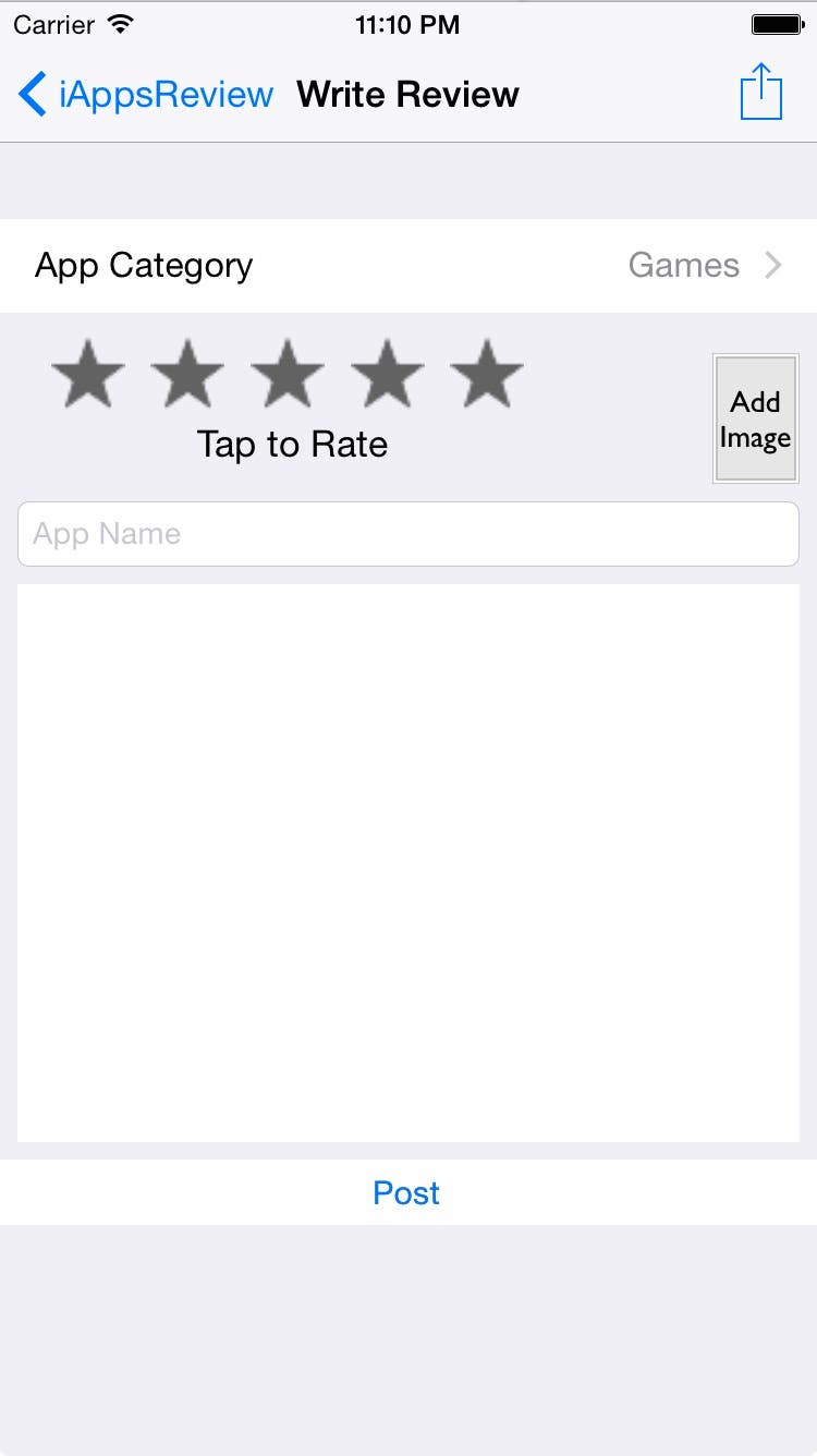 |
| Figure 21 - The Write Review scene at run time. |
Despite our best attempt at setting up the resizing attributes for this scene, we still have extra space at the bottom of the scene. This is one of the problems you encounter when using the older "springs and struts" iOS resizing technology. In a future post we will convert the scenes in the app to use the newer Autolayout which is greatly improved in Xcode 6.
- For now, in the Write Review scene, you can click the buttons and see they are not functional yet. However, if you click in the text field or text view, notice the keyboard pops up from the bottom of the screen as shown in Figure 22. You can click on the keyboard keys to type text into either of the text controls. However, as it stands right now, there's no way to make the keyboard disappear when you're done. We will fix this issue in an upcoming post! For now, you can click the back (iAppsReview) button to return to the main scene, and then navigate back to the Write Review scene to hide the keyboard.
 |
| Figure 22 - The keyboard appears when you click on the text field or text view. |
- Go back to Xcode and click the Stop button to stop the app from running in the Simulator.
Adding an App Category Scene
I'd like to make some more forward progress on the app in this post, so we'll add one of the easier scenes in the app—the App Category scene. This is the scene that is displayed when the user taps the App Category row in the Write Review scene. It allows them to select a category of app from a predefined list.
- Since the App Category scene allows the user to select one item from a list, it makes sense to add a table view controller to the storyboard. To do this, drag a Table View Controller from the Object Library and place it to the right of the Write Review scene as shown in Figure 23.
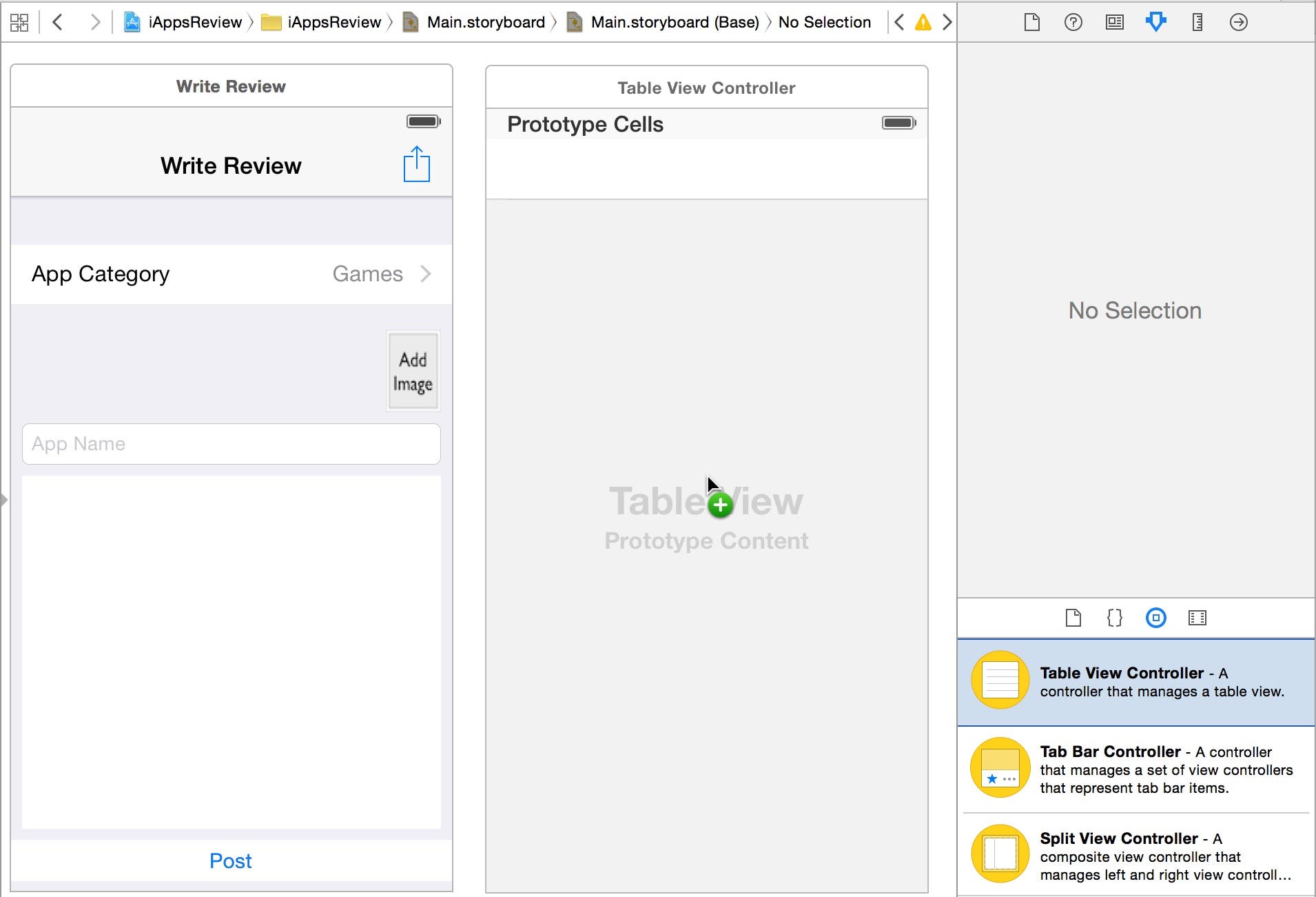 |
| Figure 23 - Add a Table View Controller to the storyboard. |
- Now let's create a segue between the Write Review scene and the new table view controller scene. To do this, hold the Control key down, click on the App Category cell in the Write Review scene and drag your mouse pointer over to the new Table View Controller scene. When the Table View Controller scene is highlighted in blue as shown in Figure 24, let go of your mouse button.
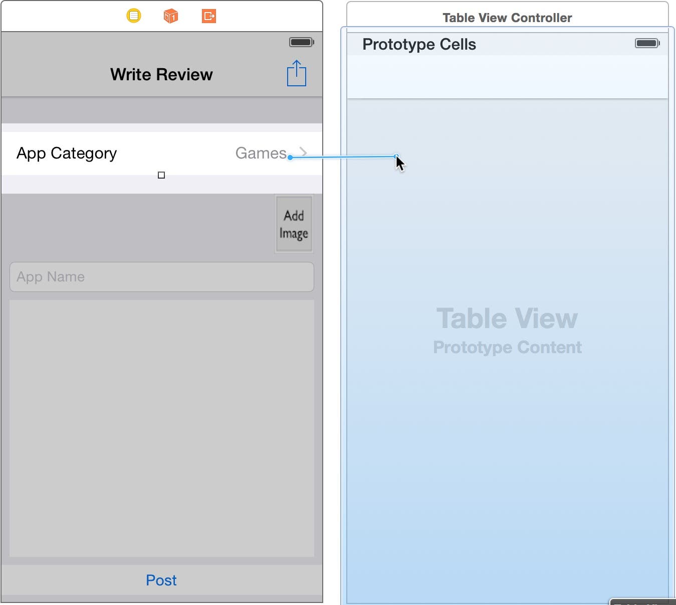 |
| Figure 24 - Create a segue to the new Table View Controller scene. |
- In the segue popup that appears, select the push option as shown in Figure 25.
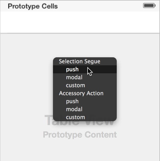 |
| Figure 25 - Select push in the segue popup. |
This adds a segue between the scenes, and adds a navigation bar to the top of the Table View Controller scene (Figure 26).
 |
| Figure 26 - The new segue appears between the scenes. |
- Now let's change the title of the new scene. To do this, double-click in the empty navigation bar at the top of the scene to put it into edit mode. Next, type the text App Category (Figure 27) and then press the return key.
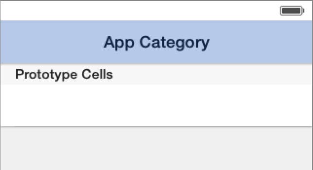 |
| Figure 27 - Set the title to App Category. |
- Next, let's change the appearance of the table view. First, click in the gray area labeled Table View Prototype Content to select the table view. Next, go to the Attributes Inspector and change the Style to Grouped. This causes the table view to take on the grouped appearance you have now become familiar with (Figure 28).
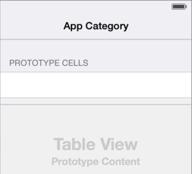 |
| Figure 28 - Set the table view Style to Grouped. |
- in the prototype version of the app, we want to display a static list of app categories in the table view, so go back to the Attributes Inspector and change the Content to Static Cells. This adds two additional cells to the table view. Since all of the cells in this table view will have the same general appearance, we only need one cell in the table view, so let's delete the last two cells. To do this, click on the second cell in the table view, hold the shift key down, and then click on the third cell to select it too. With both cells selected, press the delete key which leaves one cell remaining (Figure 29).
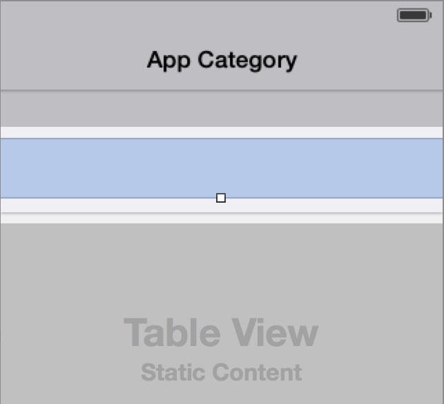 |
| Figure 29 - Delete the last two cells in the table view. |
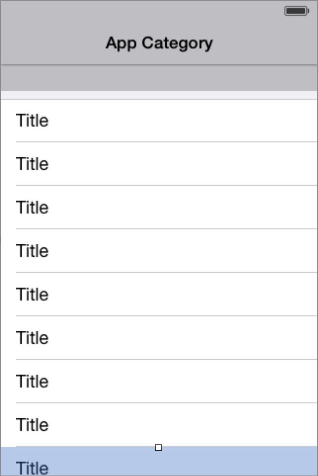
- For this App Category list, we only need a single label in each cell of the table view. To make this happen, go to the Attributes Inspector and change the Style to Basic. This adds a label with the text Title on the left side of the cell (Figure 30).
 |
| Figure 30 - Set the table view's Style to Basic. |
- We need to add several cells to this table view that each specify a different app category. To do this, with the first cell selected, press Command+D eight times, to create a total of nine table view cells (Figure 31).
 |
| Figure 31 - Create duplicate cells. |
- Now we need to change the text of each cell to a different app category. To do this, double-click the left side of the first cell in the table view. This puts the label's text into edit mode. Next, type the text Entertainment, and then press return. Now change the text of all the other cells in the table view as shown in Figure 31.
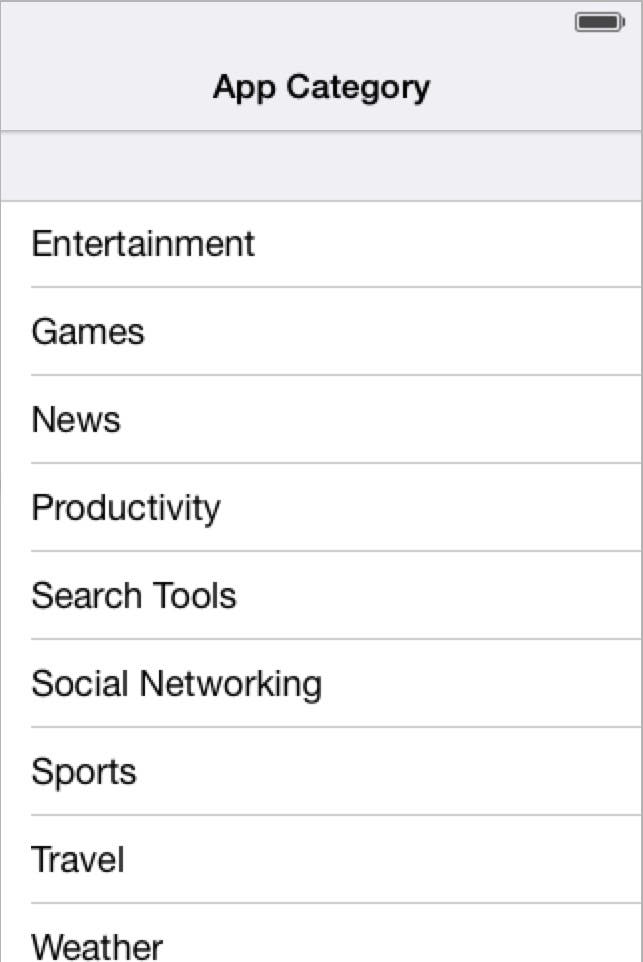 |
| Figure 31 - Set all the app categories. |
- There is one final step we need to perform to finish the prototype version of this scene—add a checkmark to the Games cell. Remember, in the Write Review scene, the App Category cell text indicates the Games category is currently selected (Figure 1). Although the user won't be able to select a different cell in the prototype (they will be able to do that when we complete the app), we need to place a checkmark in the Games cell to reflect the current selection.
To do this, select the Games cell in the table view, and then go to the Attributes Inspector, and change the Accessory to Check Mark. This displays a checkmark on the right side of the cell as shown in Figure 32.
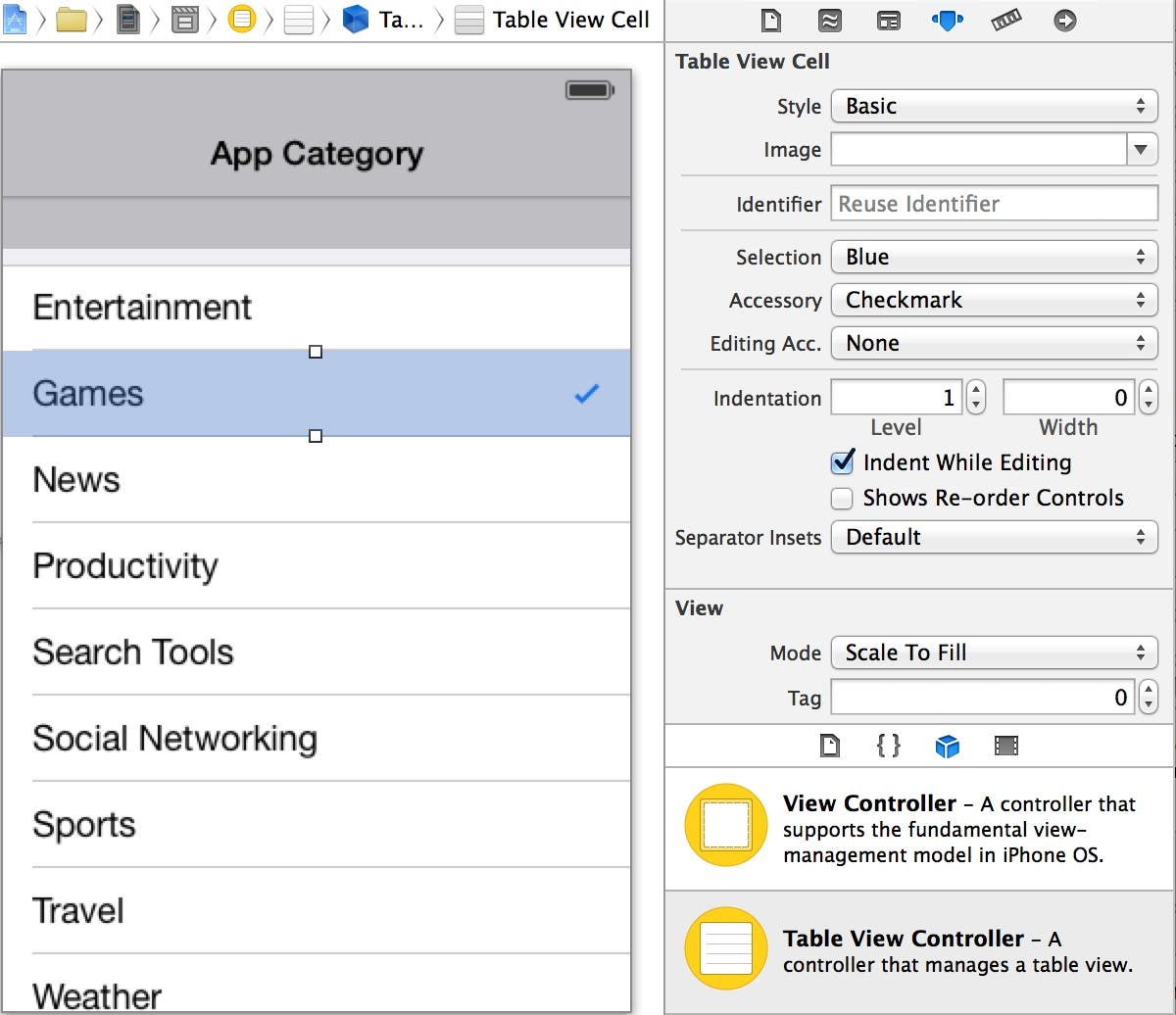 |
| Figure 32 - Set the Accessory to Checkmark |
Running in the App in the Simulator
Now you're ready to run the app in the Simulator to see how it looks!
- Click Xcode's Run button, and when the app appears in the Simulator, click the Write Reviewrow to navigate to the Write Review scene. Afterwards, click the App Category row and you will be taken to the new App Category scene where you can see the check mark in the Gamesrow as shown in Figure 33.
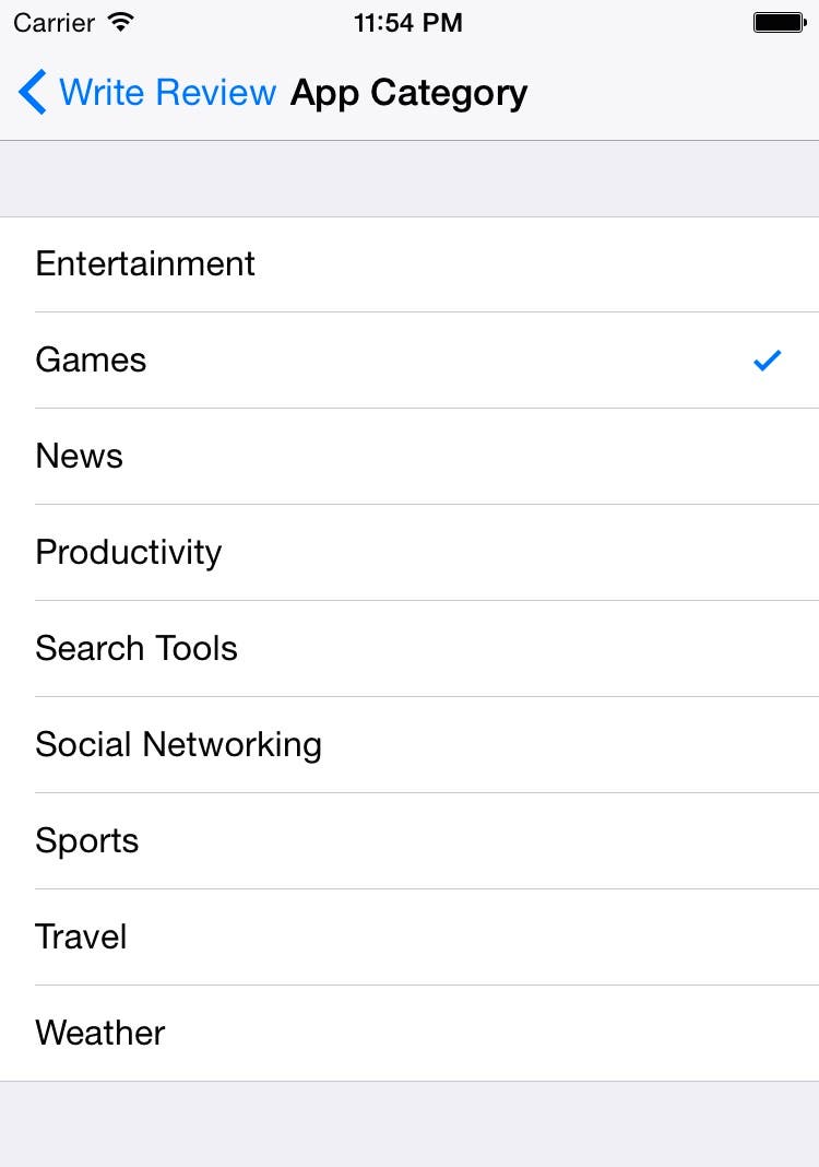 |
| Figure 33 - You can see the check mark at run time! |
- Go back to Xcode and click the Stop button to stop the app from running in the Simulator.
Conclusion
In this post, you were introduced to four new user-interface controls: the text field, text view, image view, and the button. You also reviewed information on how to add a table view controller to a storyboard and configure the table view, including adding a check mark to indicate a selected item. In case you ran into trouble going through these steps, you can download the completed project from this link.
In my next post, we will finish the prototype app by adding a few new scenes and configuring them to suit our needs. After that, we will learn the basics of writing code so we can turn our prototype app into a fully functioning app!


