Yesterday, Instagram introduced a new icon and app design meant to focus on content. My first thought was, “dear god why?” While the new logo is full of pretty rainbow gradient, it barely looks like a camera at this point and completely abandons the nostalgic polaroid look of the original. Alas, all good things must come to an end, but we can complain about it anyway.
Instagram sister apps Layout, Boomerang, and Hyperlapse also saw a logo redesign, but the changes are significantly more similar to their predecessor than the main Instagram logo.
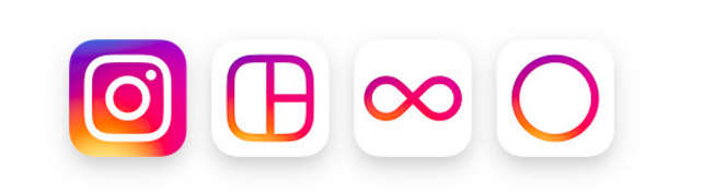
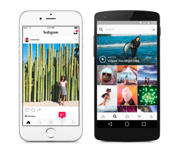
The app itself was changed within to create a cleaner, more streamlined look. It’s designed to put more focus on your photos and videos without changing how you navigate. But the only difference that pops out to me is the bolded black lettering and logo throughout.
I must say, I do like Instagram’s video to present the new logo. It shows some of the multiple variations the redesign underwent before settling on this strange finally.
I highly doubt an unwelcome logo change will affect Instagrams massive user base at all, but it has certainly opened the floodgates of opinion. And the people of Twitter have spoken:
You need some ice for that burn Instagram?
What do you think of the redesign?